
How to Choose Event Backdrops That Look Right
Learn how to choose event backdrops that feel refined, photograph beautifully, and suit weddings, parties, and brand events with style.
A backdrop can make a beautiful installation feel editorial – or make the whole setup look like an afterthought. That is why knowing how to choose event backdrops matters so much. Whether you are planning a luxury wedding, a private celebration, or a brand-led corporate event, the backdrop is not just a background. It sets the tone, frames every photograph, and quietly decides whether the experience feels polished or generic.
The best event backdrops do two jobs at once. They create a visual focal point in the room, and they support the guest experience without shouting over it. When chosen well, they give a photo booth, interactive activation, or portrait area a sense of place. They make the imagery feel intentional, cohesive, and worth sharing.
How to choose event backdrops for the right kind of event
The first decision is not colour, pattern, or flowers. It is context. A backdrop for a black-tie wedding reception should not be approached in the same way as a product launch, festive party, or immersive brand activation.
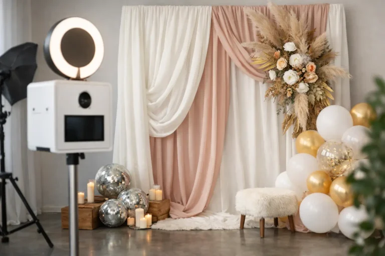
For weddings, the brief is usually emotional as much as visual. Couples tend to want something timeless, flattering, and in keeping with the wider styling of the day. That might mean soft draping, refined neutral tones, a floral moment with structure, or a clean editorial finish that lets the photography lead. The question is not simply what looks impressive in the room. It is what will still look elegant in the images years later.
Corporate events tend to ask more from a backdrop. It may need to carry branding, support content creation, draw footfall, and complement a larger event design scheme. In that setting, a backdrop often becomes part of the guest journey. It should feel unmistakably premium while still working hard in practical terms, especially if guests are sharing images live or if the activation is expected to deliver branded content.
Private celebrations sit somewhere between the two. They often allow for more personality, but the same principle applies. The backdrop should feel deliberately chosen for the occasion, not dropped in as a separate element.
Start with the room, not the sample swatch
One of the easiest mistakes is choosing a backdrop in isolation. A textured panel, shimmer wall, or floral installation might look striking in a gallery image, yet feel completely wrong once placed inside a particular venue.
Begin with the space itself. Look at ceiling height, natural light, wall tones, flooring, and the visual character of the venue. A country estate with warm stone and soft architectural details will usually suit a different treatment from a modern city venue with dark finishes and dramatic lighting. Boutique hotels, luxury barns, orangery spaces, and marquees each ask for their own level of contrast and scale.
Proportion matters more than many people expect. A backdrop that is too small can disappear, while one that is too dominant can make the installation feel heavy-handed. If the venue already has strong design features, your backdrop may need to complement rather than compete. In a cleaner, more minimal setting, a statement backdrop can bring the room into focus.
This is also where finish becomes important. Matte surfaces often photograph more elegantly than anything too reflective, especially under mixed event lighting. That does not mean shine has no place. Mirrored or gloss details can look exceptional in the right environment. It simply depends on whether the finish adds sophistication or visual noise.
Choose a backdrop that flatters photography
If the backdrop sits behind a photo booth, portrait setup, or interactive installation, it must work on camera. Guests will not analyse the material choice, but they will notice if photos look dark, harsh, busy, or oddly dated.
A good backdrop supports skin tones, adds depth, and keeps attention where it belongs – on the people in front of it. This is why overly fussy patterns can be a risk. Intricate prints, excessive contrast, or novelty graphics often distract from the subject and can date quickly.
Neutral tones, soft texture, and considered layering tend to deliver the most versatile results. Cream, taupe, warm white, stone, muted blush, olive, soft black, and champagne often photograph beautifully, particularly when paired with quality lighting. Richer tones can also be very effective for evening events or brand moments, but they need to be balanced properly so the final images still feel clean and elevated.
When clients ask what feels most luxurious in photographs, the answer is usually restraint. The backdrop should add atmosphere and identity, not fight for attention.
Texture often matters more than pattern
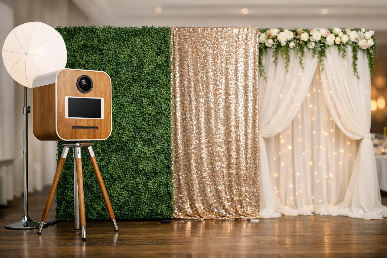
Texture gives images a premium finish without making them feel crowded. Draped fabric, velvet, panelled structures, softened metallics, florals used with intention, or a carefully built layered set can all create dimension in a way that remains refined.
Pattern, by contrast, is harder to control. It can work brilliantly for certain branded experiences or fashion-led events, but it needs confidence and a very clear creative direction. If there is any doubt, texture is usually the stronger route.
Match the backdrop to the guest experience
A backdrop should never be treated as a decorative extra. It is part of the experience guests are walking into.
If the setup is designed to feel glamorous and editorial, the backdrop needs to support that mood instantly. A black-and-white portrait concept, for example, benefits from clean lines, tonal depth, and an uncluttered setting. A retro-inspired booth may allow for more character, but it still needs curation to avoid slipping into novelty. AI-led activations and live creative installations often need backdrops with more architectural presence, so the experience feels immersive rather than improvised.
Think about what guests are meant to feel when they approach the space. Are they stepping into a sleek portrait moment? A playful but polished interaction? A branded content area with impact? The answer should guide the backdrop choice just as much as the venue design does.
This is where a design-led supplier adds real value. The most successful installations are not built around a single pretty backdrop. They are curated as complete visual experiences, with the backdrop, lighting, booth styling, surrounding space, and final output all working together.
Branding should feel integrated, not applied
For corporate events, branding is often non-negotiable. The challenge is making it feel premium.
A logo repeated across a step-and-repeat can suit some occasions, particularly press-led environments, but it is not always the most elegant option for guest-facing events. If the aim is elevated brand engagement, it is often more effective to integrate branding more selectively through colour, messaging, set styling, digital overlays, or subtle structural details.
The backdrop should still feel aligned with the brand world, but not at the expense of the guest image. Guests are far more likely to share photographs that make them look good. That means brand visibility has to work in partnership with aesthetics.
For launches and activations, ask a simple question. Do you want guests to stand in front of the brand, or inside it? The second option usually creates the stronger impression.
Consider logistics without letting them lead the creative
Practicalities matter, especially at high-spec venues and tightly run events. Access, setup times, flooring, power, ceiling restrictions, turnaround windows, and guest flow all have a direct impact on what is possible.
Even so, logistics should refine the creative rather than flatten it. The right backdrop choice balances both. It should be feasible within the venue and event schedule, but still feel ambitious enough to justify its place in the room.
This is particularly important if the installation needs to perform across different points in the event. Daytime natural light, evening uplighting, flash photography, and crowd movement can all change how a backdrop reads. Something that looks delicate and airy at 2pm may feel underwhelming by 9pm if the lighting has not been considered.
How to choose event backdrops that still feel current later
Trends move quickly. That can be useful if you want the event to feel fashion-aware, but it can also date the imagery faster than most clients would like.
The strongest approach is often to nod to current design language without relying on it completely. Clean shapes, beautiful materials, tonal depth, sculptural florals, and thoughtful styling generally age better than anything overly theme-led. This is especially true for weddings and milestone celebrations, where the images become part of a personal archive.
For brands, being current matters more directly, but timelessness still has value. A backdrop can feel contemporary without being throwaway. The key is choosing a visual direction with clarity, rather than chasing several ideas at once.
MooMuu Experiential approaches this with a distinctly design-conscious lens – creating installations that feel modern and memorable, yet still refined enough to sit beautifully within prestigious venues and polished brand environments.
The backdrop that works best is rarely the loudest one in the room. It is the one that belongs there. It complements the venue, flatters the photography, enhances the guest journey, and makes the whole experience feel unmistakably considered. If you choose with that standard in mind, the final result will not just look good on the night. It will leave a lasting impression long after the event has ended.