
How to Style a Photo Booth Backdrop Well
Learn how to style a photo booth backdrop with a refined, design-led approach that suits weddings, parties and polished brand events.
A beautiful booth can still fall flat if the backdrop feels like an afterthought. Guests notice the full frame, not just the camera, and the backdrop is what turns a quick snap into something editorial, flattering and worth keeping. If you’re wondering how to style a photo booth backdrop, the answer starts with treating it as part of the event design, not a separate add-on.
The strongest backdrops do two jobs at once. They create instant visual impact in the room, and they photograph exceptionally well from every angle. That balance matters more than most people expect. A backdrop that looks impressive in person but reflects light awkwardly, creases under flash or competes with outfits will never give you the polished finish you want.
How to style a photo booth backdrop with intention
Start with the setting. A backdrop should feel anchored to the venue rather than dropped into it. In a country house or private estate, that usually means drawing on existing textures and tones – stone, oak, soft neutrals, candlelight, brushed metallics. In a modern corporate space, the styling might lean cleaner and more architectural, with sharper lines, monochrome palettes or subtle brand detailing.
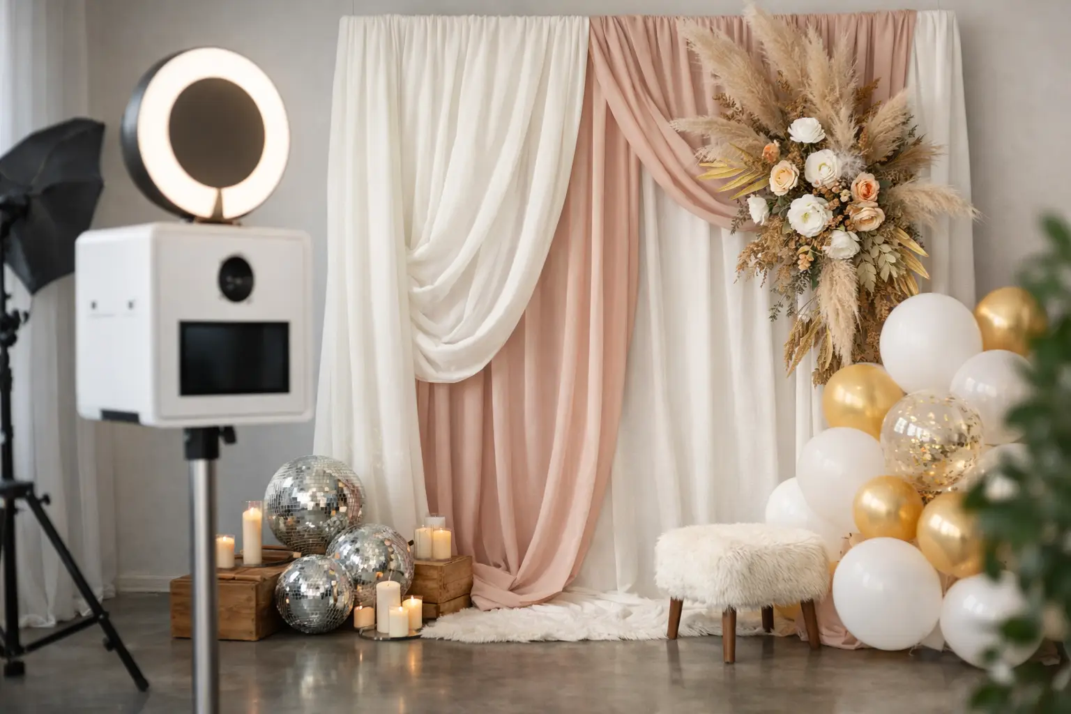
This is where restraint often creates a more luxurious result. Not every backdrop needs layers of florals, signage, props and pattern. Sometimes a single, beautifully finished surface in the right tone creates the strongest frame, especially when paired with elevated lighting and a design-led booth. If the booth itself is oak-crafted or sculptural, the backdrop should complement it, not fight for attention.
Scale is another detail that is often missed. A backdrop that is too narrow leaves dead space around guests. One that is too low can feel visually cramped in photographs, particularly with groups. The right proportions make the installation feel deliberate and generous, which is exactly what guests read as premium.
Begin with the event aesthetic
Before choosing materials or styling details, define the atmosphere you want the booth to create. Romantic and softly luminous feels very different from fashion-led black and white glamour. A celebratory wedding backdrop may call for movement, softness and texture, while a brand activation might need cleaner styling that gives content a sharper, more contemporary edge.
Colour is where this comes together quickly. Neutrals remain the most versatile because they flatter skin tones, work across dress codes and let guests stand out in the image. Ivory, stone, champagne, warm taupe and soft black all tend to photograph beautifully. Brighter shades can work, but only when used with confidence and context. If the event palette is already expressive, the booth backdrop usually benefits from being the grounding element.
Pattern needs an especially careful hand. On camera, busy prints can become distracting, and highly detailed motifs may date more quickly than simple finishes. Texture is often the better choice. Draped fabric, matte panelling, ripple surfaces, velvet, pleating and softly reflective finishes add dimension without overwhelming the shot.
Choose materials that look refined on camera
The question is not simply what looks lovely in the room. It is what holds up under repeated photography across an entire event. Some materials absorb light in a flattering way, while others show every crease, mark and shadow.
Fabric remains a classic choice because it introduces softness and depth. The key is finish. Crisp, properly tensioned draping looks elegant; limp or uneven fabric does not. Velvets and heavier textiles can create a richer, more cocooned effect, particularly for evening receptions or black-tie events, while sheer layers can feel lighter and more romantic in daylight-led spaces.
Panelled backdrops tend to deliver a cleaner, more architectural look. They work particularly well for corporate events, fashion-led parties and contemporary weddings where structure matters as much as softness. Mirror, gloss and metallic details can be striking, but they need thoughtful positioning. Too much reflection can interfere with flash and create visual noise in the final images.
Florals can be exquisite when used with discipline. Rather than covering the entire backdrop wall, consider floral framing, asymmetrical placement or one statement moment. This keeps the installation elevated and allows the photography to breathe. The goal is not to build a flower wall by default. It is to create a backdrop with shape, contrast and intention.
Styling for weddings versus brand events
The most successful backdrop styling reflects the purpose of the event. At a luxury wedding, the booth should feel like a natural extension of the celebration. Guests are already immersed in a carefully chosen palette, tablescape and setting, so the booth backdrop should continue that visual language. Think softness, cohesion and finishes that feel timeless when couples look back through their gallery.
At a corporate event, the priorities shift slightly. Brand presence matters, but subtlety matters too. A backdrop overloaded with logos rarely feels premium. It also narrows the appeal of the images when guests share them. A more refined approach is to incorporate brand colours, a discreet monogram, tailored graphic elements or a polished campaign motif within a design that still feels editorial and guest-friendly.
There is a useful trade-off here. The more overt the branding, the more controlled the message becomes. The more elegant and understated the styling, the more likely guests are to engage naturally and share the content widely. The right decision depends on whether the event is aiming for pure awareness, hospitality, internal celebration or something more experiential.
Light matters as much as the backdrop itself
Even the most beautifully styled installation can underperform if the lighting is poor. In fact, many backdrop issues are really lighting issues. Harsh overhead lights flatten texture. Mixed colour temperatures can distort tones. Gloss surfaces may bounce light in ways that distract from faces.
A strong booth installation uses lighting to shape the backdrop, not just illuminate it. Soft, flattering front light helps guests look their best, while subtle separation light can give the backdrop depth and stop everything feeling visually flat. This is particularly important for monochrome or glam-style photography, where tonal contrast does a lot of the heavy lifting.
If the room lighting is dramatic, moody or dim, the booth area should still feel intentionally lit. Guests should never have to search for the moment or wonder whether the space is part of the event. The backdrop needs presence in the room before anyone steps in front of it.
Props, signage and finishing details
If your backdrop is refined, the accessories around it need to be equally considered. Random props or novelty pieces can quickly undermine an otherwise polished setup. This does not mean a booth must feel overly serious. It means every detail should feel curated.
Signage should be minimal and well-finished. If there is a message, keep it concise. Neon can work in the right setting, particularly for after-dark celebrations, but it should sit within the composition rather than dominate it. Plinths, side tables, floral accents and framed details can all help the installation feel complete, provided they do not crowd the guest area.
Space planning matters here too. Guests need enough room to gather, pose and move naturally. An over-styled backdrop zone can make group shots awkward. The best installations feel generous and effortless, even when every detail has been thought through.
How to avoid a backdrop that feels tacky
Usually, it comes down to too many competing ideas. Too much shine, too many colours, too many props, too much wording. Luxury styling is rarely about adding more. It is about editing well.
One strong focal material, one clear palette and one visual mood is often enough. From there, everything else should support the photograph. Ask a simple question at each stage: does this make the final image more elegant, or just busier?
Consistency is the deciding factor. If the event is black tie, the backdrop should reflect that level of polish. If the celebration is modern and fashion-led, the styling should feel sleek and current. If the venue has a softer countryside character, a backdrop that feels too stark or corporate may jar. A well-styled booth never looks generic because it has been designed for that room, those guests and that atmosphere.
For clients planning a luxury wedding or prestigious event, this is why a design-led approach matters. The backdrop is not just a background. It is part of the guest experience, part of the room styling and part of the visual legacy of the event. At MooMuu Experiential, that is exactly why booth installations are curated as statement moments rather than standard setups.
When you style a photo booth backdrop with the full event in mind, the result is more than attractive. It feels unmistakably placed, beautifully photographed and genuinely worth stepping into.